Colour theory editorial layouts using Midjourney and a human.
palette ai
Working off the premise that less is more, simple single-word prompts were fed into generative AI, to see what interpretations would appear.
These were not ordinary single-words. They were concepts that could conjure up so much about the world around us: symbols, culture, traits, nature, design, behavior, history, science, language, fable, psychology, meaning, communication, institutions, emotion.
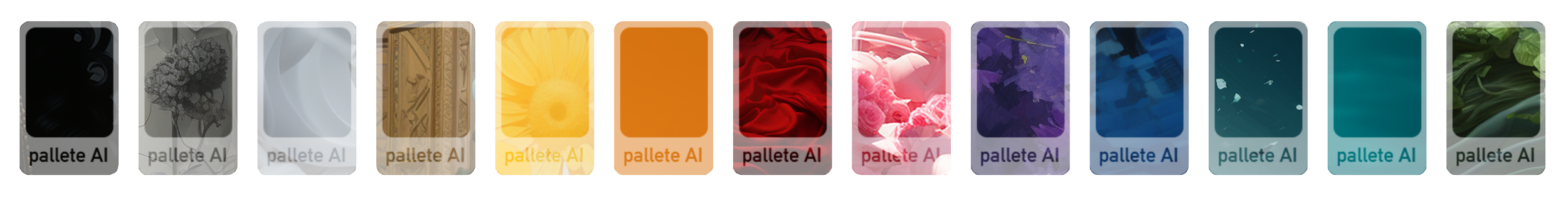
Those single words? 13 different colours:
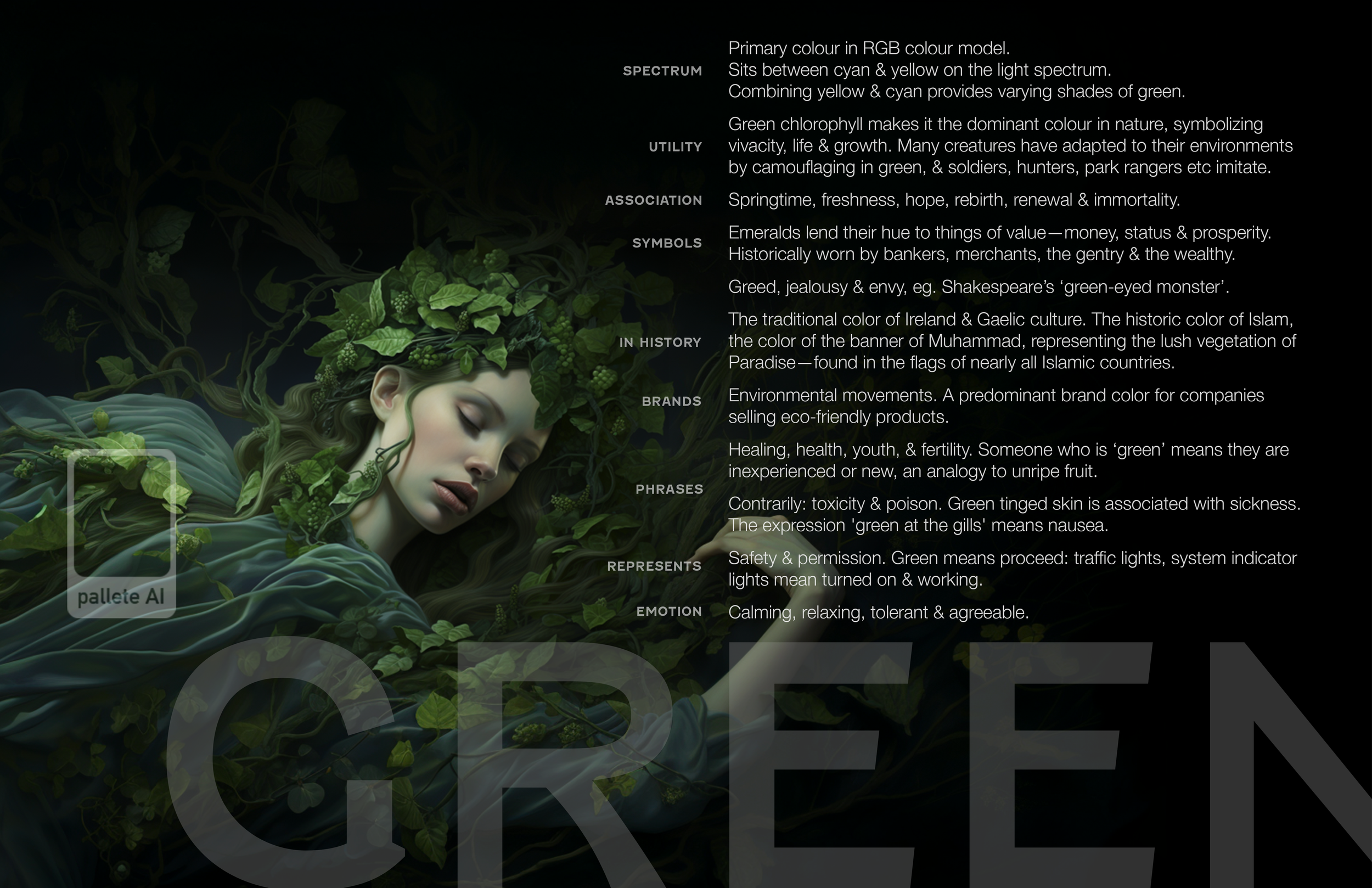
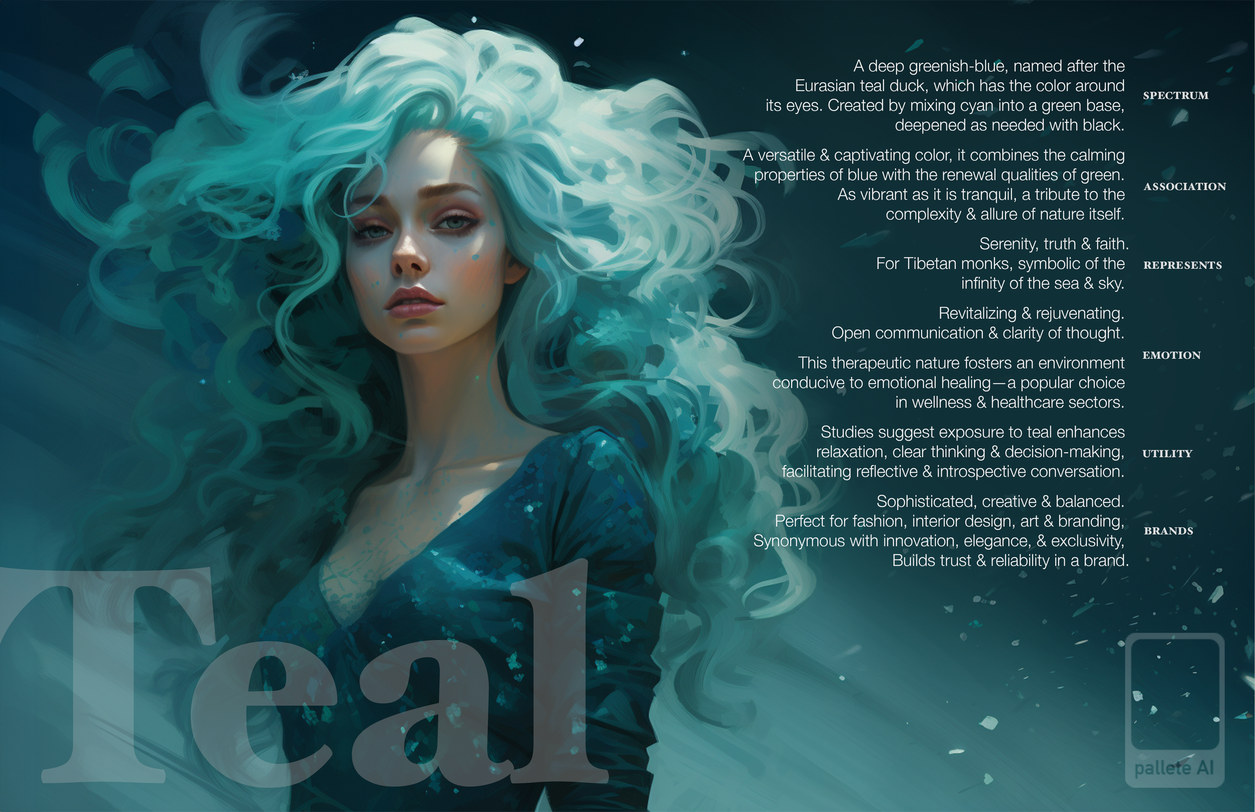
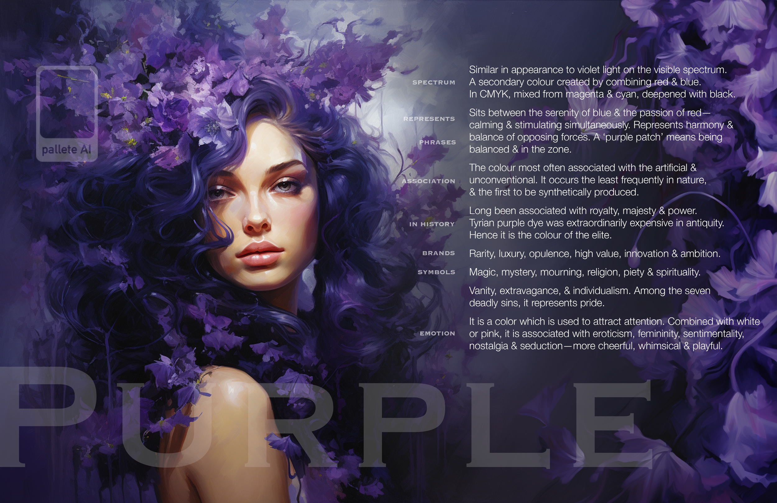
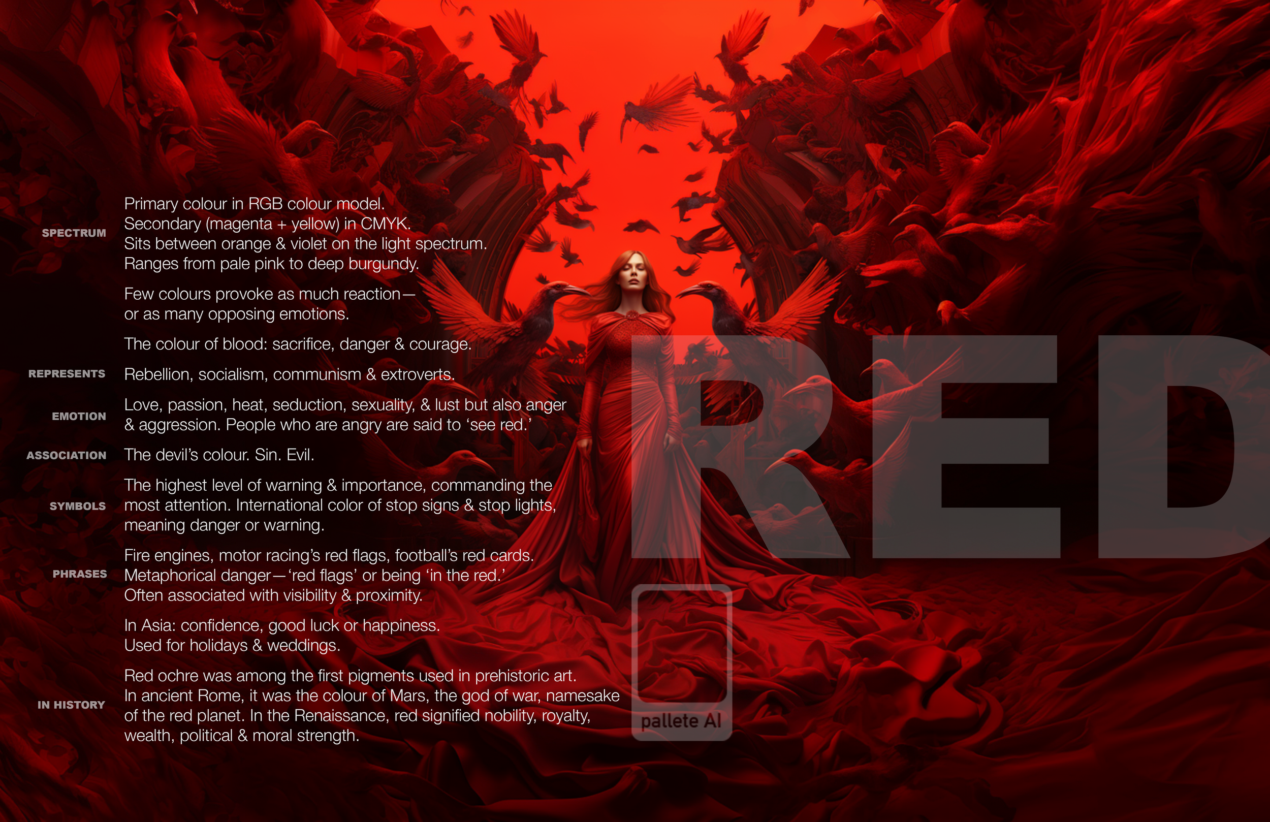
White, Grey, Black, Green, Aqua, Teal, Blue, Purple, Red, Pink, Yellow, Orange, Tan.
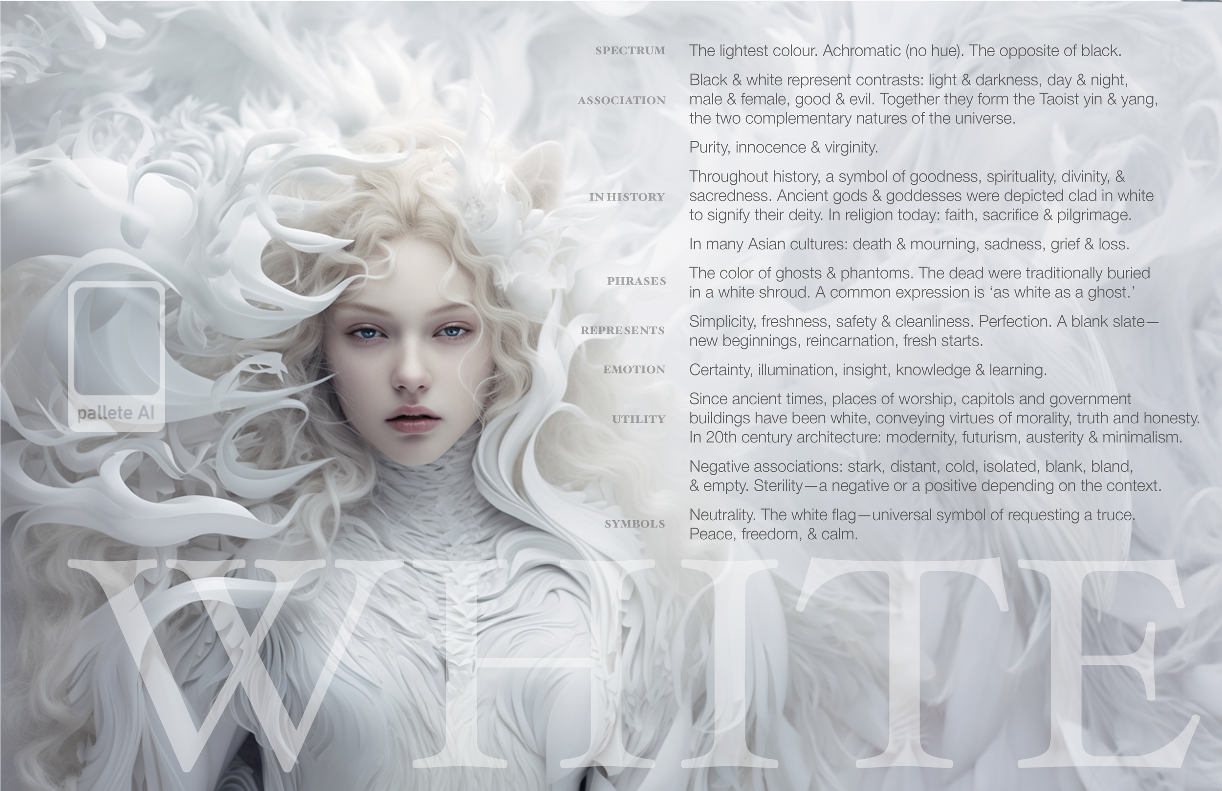
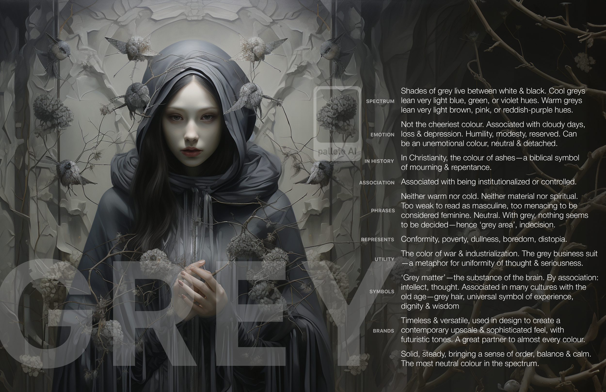
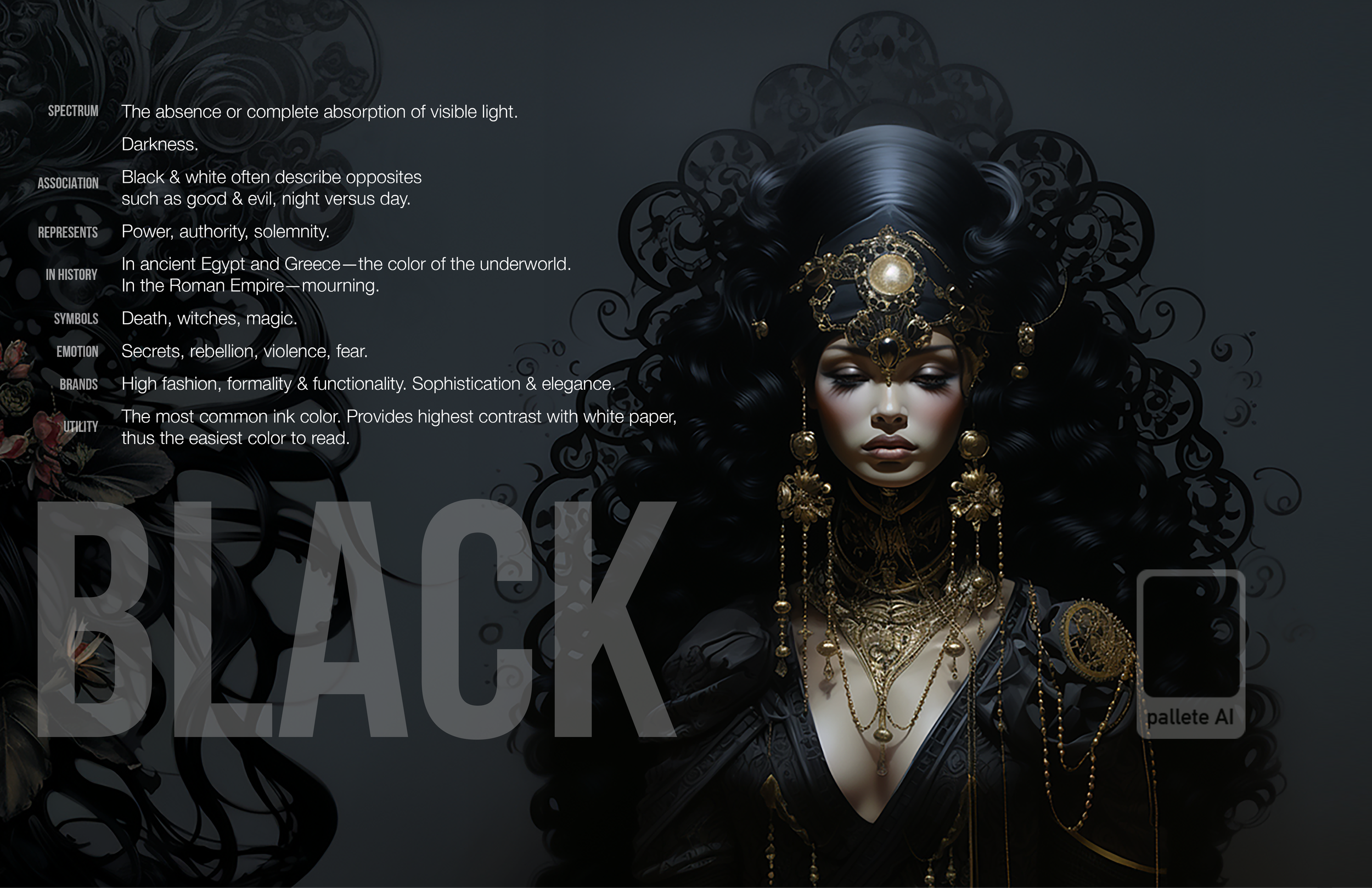
I provided the concept. I let the machine interpret tapping into the theory, psychology, science, culture and history of colour. From the options provided, I curated the imagery I felt most aptly captured the personality of the colour. Interestingly themes carried through. Some solutions only took one prompt attempt. Others took no more than a handful of repeated one-worded prompts. I then built out the full editorial composition of the artwork through iterative prompts and good ole Photoshop.
Next was the design of the colour chip courtesy of Illustrator, choice of appropriate font to match the personality of the concept art and the colour, and some involved research into each colour’s theory and psychology. Once first drafts of the copy were written, I iterated them for structure and concision with Claude.
The constraint was deliberate. The results justify it.
Intended to be an educational resource for art students, junior designers and marketers, it proves that AI collaboration can produce effective, stunning results when ideation, creative judgment and refinement are curated by a creative director’s hand, melding generative art with experienced writing and design craft.